Created by: Paul Pitcher
Created: Aug 16, 2025
Updated: Oct 25, 2025
Verified: Oct 25, 2025
On-object interaction
also called "On-object"
In mar 2023 power bi introduced a major shift in the user interface of Power BI.
here is a link to that anoucement (tip: its a long article filled with helpful information). As i have been learning Power BI (Dec 2023 - fall 2025) The help files & youtube videos that i have been watching will have some content created in one of these 2 formats however they don't tell you which one they are using up front. As a newbie to power BI i couldn't figure out why i wasn't able to in some cases follow the instructsion that were being given in the training materal. When i learned about this user interface change it helped me alot and so i decided to write this helpfile. Note: this interface change is optional, and because of this some people are still using the old settings from before mar 2023. my guess is that since this is a big change to the interface microsoft wanted to give users a choise in which one to use. as a newbie to Power BI however it created a bunch of confusion for me. as of oct 2025 the "On-Object interaction" is still turned off by default for people installing power BI. WOW!!! as i was reading online some people really hate it. so im guessing we will continue to see helpfiles in both formats for a while. i hate the new interface changes in windows 11 yet im still using windows 11 because support for windows 10 has ended as of oct 2025. one last thought. From what i can tell the "On-object interaction" is turned on when taking the PL-300 test.
The screenshots below have been hightlighted with 4 colors and is helpful in understanding the similarities and difference between the two interfaces.
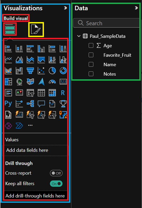
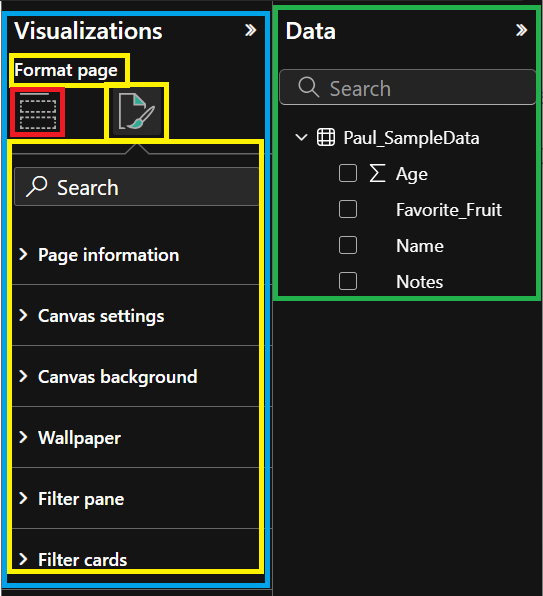
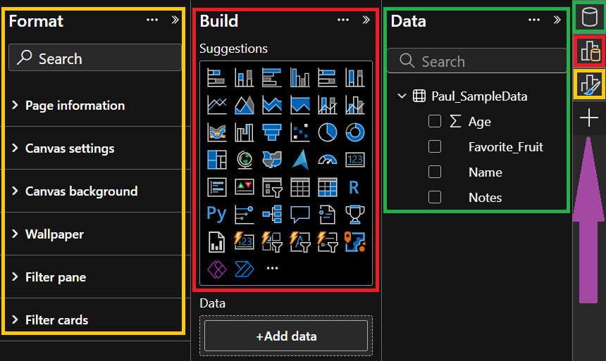
1. Green = this is your data pane (which is the same in both versions)
2. Blue = this is your visualization pane (pre mar 2023 interface only)
2. Red = this is your build Pane
3. Yellow = this is your Format Pane
1. Before mar 2023 interface (visulization pane)
| Build visual |
Format page |
 |
 |
2. After mar 2023 interface ... Microsoft calls this the "On-Object interaction". This help file will uses this term as well.
Tip: visulization pane is removed. The pane manager on the far right hand side is added. purple arrow, we talk about this in more detail below.

Before mar 2023 the "Build Pane" and "Format Pane" where combined in the "Visualizations pane". After mar 2023 the "Build Pane" and "Format Pane" are now on there own. From my experinace its actually really nice having them in their own windows. in my work flow I go back and forth a LOT between these two panes and being able to see both of them at the same time is really nice.
In the "Before mar 2023 interface" i had to click with my mouse a 100+ times a day to go back and forth between these two panes.
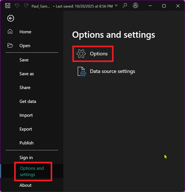
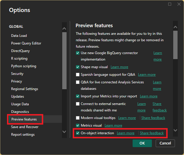
To enable/disable the "On-Object interaction" follow these steps
1. from the ribbon menu select "file"
2. In the bottom left corner select "Options and Settings"
3. from the "Options and settings" window click on "Options".

4. From the "options" window click on "Preview features".
5. Under the "Preview features" check the box next to "On-object interaction" to enable this feature.
if you uncheck the box it will turn off the "On-object interaction" options.

Microsoft helpfile
Tip: This feature was added to power BI Mar 2023
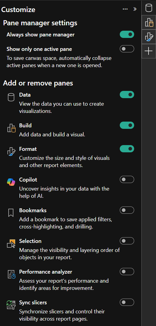
Pane Switcher
Also called "Pane Manager"
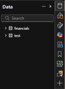
Tip: When you turn on "On-Object interaction" you will now see a new bar on the far right of power BI. This is called the "pane Switcher" (note: i think ive also seen it called the "pane Manager"). The "pane Switcher" allows you to show/hide the panes that you would like to see. For example in this screenshot I have clicked on the "Data" pane icon and now I can see the "Data Pane" which by the way is the pane that i use the most. It's the primary way that i interact with my data source.
| data pane button has been activated |
pane manager settings |
 |
 |
Tip: if "On-Object interaction" is enabled and you single click a visual you will see
1. Circle handle shapes around the edges of your visual
2. The "Format" tab will appear at the top of Power BI (there are several examples below talking about the "format" tab.)
Tip: if "On-Object interaction" is enabled and you double click on a visual or if your right click on a visual and select "format" you will see (I should have a section of the help file going over each of these.)
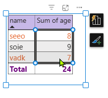
1. Squares handle shapes around the edges of your visual
2. The box of the visual will turn blue.
3. The "Format" pane will open (if it wasn't already opened) on the right hand side
4. The "Format" tab will appear at the top of Power BI (there are several examples below talking about the "format" tab.)
5. If you hover or click on a subsection they will be highlighted like this. (I need to update my help file to call these "subsection")
all 5 of these lets you know that you are now in "format mode"
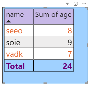
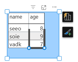
Hover = blue line. I think that this is trying to let us know which parts of the visulization we can interact with. For example as I move around the visual image, some parts of it will highlight with the blue box and some won't.

Left Click on the item will give you black lines with blue circles on corners

How come I only see part of the square?
A: I think that this is a bug. I'm not sure how to recreate it.

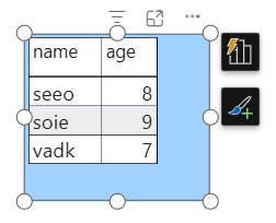
Gray Handles (not in "On-Object interaction" mode) (pre-mar2023 interface)
Tip: if you single click or double click on a visual and you see gray lines around the edges of your visual, this means that you are not in "On-Object interaction" mode.

Tip: If "On-Object interaction" is turned off, double clicking on a visualization does nothing. If you right click on a visual you are also given fewer options.
"On-Object interaction" Single Click (I'm not sure what the official name for this is.)
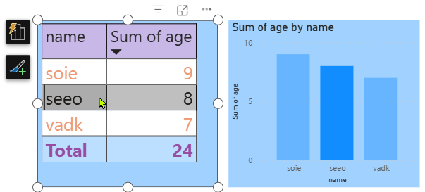
If you click on a table one time you see circles handle shapes on the edge of your visual.

1. You can interact with the format options and change your charts
2. You can interact with the data. For example you may want to use the table/chart that is selected to interact with other visualizations. For example if I were to click on "seeo" in my table it will cause that my bar chart is filtered for "seeo".

Tip: There are some things that you can't do in "format Mode" (square handles). For example if you want to change the width of the columns in your table you can't do so while in "Format mode" (square handles).

You have to single click on a chart so that you see round handles around your visualization. Next move your mouse over the column divider until you see the double-headed icon (is this the actual name?), and then you can click and drag your mouse left or right to change the column width.

"On-Object interaction" Double Click - "FORMAT MODE"
If you double click on a table (or other visualizations) you see squares handles along the edge. These square handles let you know that you are now in "format mode". This will allow you to focus on Formatting the visualization that has the square boxes along the edge of the visualization. You are no longer interacting with the data, you are now going to be interacting with formatting each element of the visualization that you selected.
tip: you can over your mouse over each part of the visualization to see the different elements that you can modify.

Tip: once you are in "format mode" you don't need to double click a different visual to get into "format mode". Once you are in "format mode", you can continue to interact with other objects in "format mode". So for example if you have 3 different visuals in your report, and you double click one of your visuals, you will now see square handles around the edges of your visual. This lets you know that you are in "format mode". Now if you click on a different visual in your report it will also have square handles around the edges, because you are still in "format mode".
So for example. Lets say that I double click on a table, and I now see square handles around the visual.
If I look at the format bar all options are collapsed (if they aren't go ahead and collapse them for this exercise.)

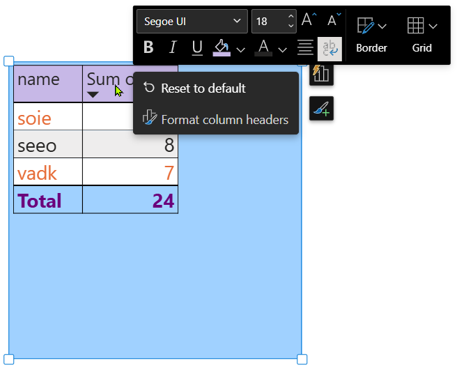
Now if you click on the "Column header" in your table

The Format bar will go to "Column headers" and open it for you so that you can make changes. I like this feature because it saves me time from having to go find the setting for a specific object that I want to change the settings for.

HUGE TIP: An even easier option is that while in "format mode" you can right click on each part of the table and it will bring up the properties for you that you can change for that object. So in this screenshot I right click on the column header, and I can see the settings that I can change just for the column header. This is really awesome.

---
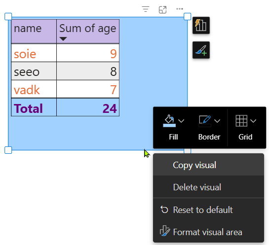
Tip: if you want to format the background of a chart to be blue, and you want the "on-object interaction" to open the settings window for you, just to where the setting is found, double click in the blue area won't work until you get right to the outer edge, then it will work. You can also right click on the border and then you will the fill and border options will become available.

---
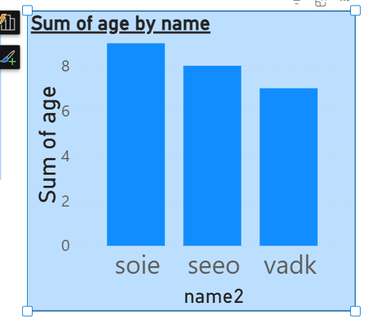
By default bar charts labels like in this example "name2" will dynamically resize as you make the entire chart bigger or smaller. But what if you want to CHOOSE the size of the "name2" at the bottom of the chart.

you would think that if you double click on it and then change the value in the format settings that you would be good to go. So in this example I have changed the value of the title to "25" however the size doesn't change.

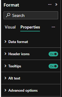
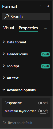
Solution: You have to go to "Format/Properties/Advanced options" and then turn "off" "Responsive". Then when you change the settings talked about above then they will work and you can then choose the size that you want.

If you double click on a bar chart, table, matrix (im sure others but I haven't tested) This will give you the square handles around the visualization and a "Format" group becomes available at the top of PBI. If you click on "Selection" this will show you the "selection" window with a list of all of the elements on your worksheet. So for example you can then click on one element at a time and look at the settings for that element.
Tip: You can also change the layer order and the Tab order from this "selection" window.

Tip: the "properties" options are pretty much the same no matter what visual you select.
The "Visual" options will change depending on the visual that you select. For example if you select a pie chart you will 6 groups of options, however when you select tht table you will see 13 groups of options.
